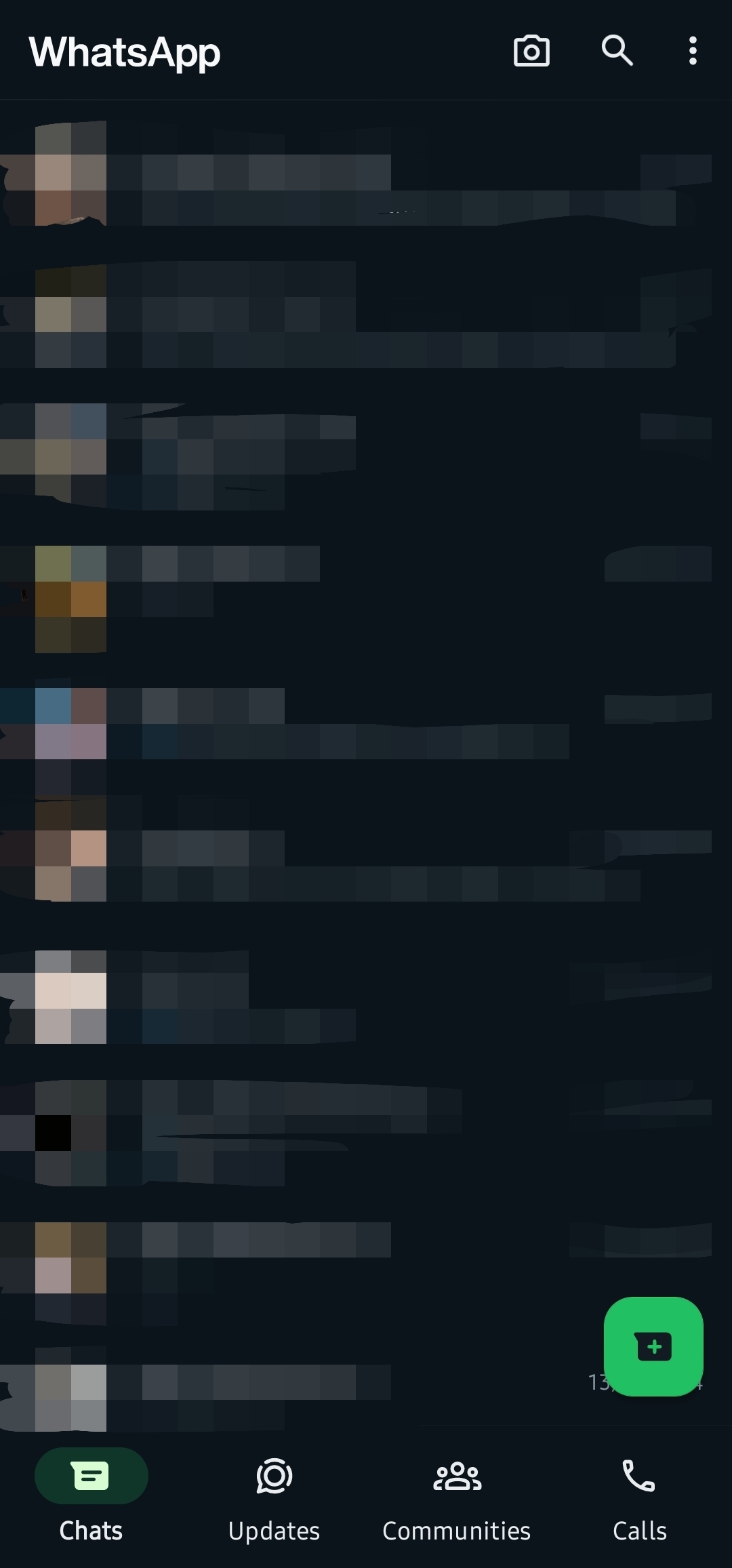
I’m not in the beta, and this is what my WhatsApp looks like now. This might be old news, but until today I had the green UI.
(Sorry for the crappy censor job. I wish Android had a blur feature built-in)
I’m not in the beta, and this is what my WhatsApp looks like now. This might be old news, but until today I had the green UI.
(Sorry for the crappy censor job. I wish Android had a blur feature built-in)
Yep. Same thing here. I got an update and the dark mode has changed in looks as well. I feel the green colour needs to be toned down a bit tbh.