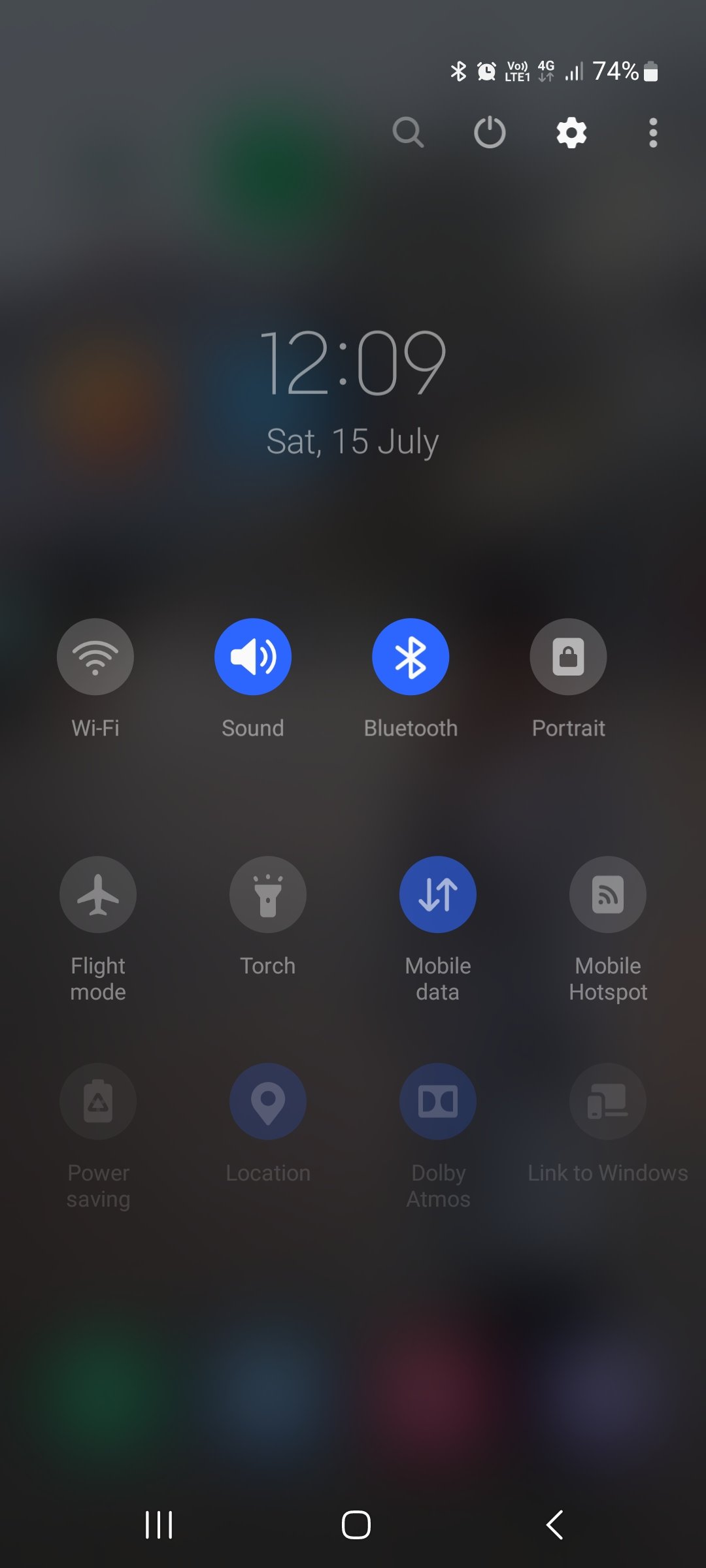
Ever since I switched back to Android after a couple years of using an iPhone SE, i have been missing the iOS feature to open “control center” (iOS term for quick shortcuts) using a swipe up gesture from the bottom of the screen.
This is a great feature that eliminates the need to reach for the top of the screen to pull down the notification shade to access toggles for commonn settings (wifi, cellular, BT, hotspot, torch, etc.). Since we live in an era of huge phones such a feature would have been extremely convenient. Unfortunately it’s not implemented in Android.
But I accidentally stumbled upon an app called Neo Launcher that has implemented a similar functionality (kind of, since iPhone control center can be summoned no matter what app you’re using, but this only works on home screen).
A dashboard pops up from the bottom of screen, where your thumb can easily reach, with a user-defined shortcut! Toggling wifi and other settings are much easier this way.
I’d highly recommend everyone to give this a try. Personally I’ve set double tap on screen as a shortcut for the dash.
But, like, you can do something similar by pulling down twice. That screen can be configured to show almost any toggle. Different actions, similar results. Is it the actions you don’t like?
The toggles are still at the top of the screen. The bottom of the screen is closer to the user’s thumbs.
This
You could do the circular swipe from right to bottom to enable one handed mode (pixel exclusive or it’s standard? In this way the screen becomes half size) and then the vertical swipe (or a swipe on the fingerprint sensor) from top to bottom to show the quick notification bar
It definitely needs some time to practice though because the circular swipe to enable one handed mode interferes with the back gesture
Yeah as you said you have to swipe down twice and strech your finger to the top of the screen (or use the other hand). Definitely a bottom dashboard is more convenient.
If the argument is that swiping down twice is more difficult than swiping up once, then I agree. If the argument is that swiping up once should be reserved for system toggles, then I disagree. I believe it’s a question of properties, not capability, when it comes to Android’s decision.
There is an option in MIUI to swipe down on left side for notifications and right side for Control Center.
Really old Android devices used to do this, particularly tablets during the HC/ICS/JB era. It was kinda confusing IMO
I think it was part of Tablet UI for Android 3.0 Honeycomb.
I have a Huawei, a Xiaomi and a OnePlus and suddenly around one year ago they all sent an update to do that - I wonder who did first and who copied it. I find it illogical, why separate notifications from the rest?
It was made for tablets in Android 3.0 Honeycomb.
I don’t know about others but MIUI (Xiaomi/Poco) have an option to disable it.
I once tried a Xiaomi phone and that was the most confusing part.
I feel the same, that’s why I turned it off.

That’s my S21 and can get there by swiping down twice anywhere on the screen.
I don’t think that’s too far up at all
Try swiping once with two fingers
Fwiw you can get the same result using three fingers.
I’ve got such a dirty mind.
Oh. M. G. Thank you
Doesn’t work for me, just wants to to then customise the home screen, probably a setting in my gesture control.
There’s an option to swipe down with one finger from the “desktop” to pull down the shade too.
Android has that too. Try to pull down from the top. Not too much different than swiping up from the bottom
The argument here is that reaching the top of huge phones with one hand is difficult.
Oh I see. I guess I’ve avoided phones that large lol. I’m on a Zflip3 right now and can reach the whole screen with my thumb. Could be a struggle with a Galaxy note though.
newer I phones also have a swipe from top (the notch iphones) which is basically the same
iirc some old vivo or some other chinese phones had this swipe from bottom because they copied ios
Honestly, the main reason I won’t go iphone is I don’t like how apple does mobile ui.
Nah, I don’t like it. Vivo Oppo phones do it and it’s very confusing for me.
How would you trigger it on Oppo, Vivo phones? With a swipe up gesture?
Yes. AFAIK it’s just a copy of iPhone feature.
I think Android 11 was doing something cool with the power menu being fused with home controls, always thought they’re going to further fuse it with the Quick Settings Panel, but they back paddled that real quick for some reason that I can’t exactly understand
Get a custom launcher, change the gestures for swiping up, profit.
Swiping up from the bottom currently opens up the app tray, what does it do on your phone?
I think it makes sense, but only if the app tray is removed like how it is on iOS.
Yeah that’s true. Swiping up from the bottom opens up app drawer.
I’ve set a shortcut using Neo Launcher to open the dashboard by double-tapping the screen.


